Beyoncé

Self-Titled Album

2025

Branding, Packaging
Concept

Released in December 2013, Beyoncé is the singer’s critically acclaimed fifth studio album and a cultural milestone in pop music. Surprisingly dropped at midnight without promotion, each song features a music video to establish the concept of being a visual album.

How does a global superstar balance the monumental pressure of public scrutiny with her private life? This self-titled album exposes Beyoncé’s most intimate sentiments: the reflection of beauty standards, struggling relationships, motherhood, and raw sexuality.

How does a global superstar balance the monumental pressure of public scrutiny with the intimate vulnerabilities of motherhood, relationships, and self-identity?

This rebranding project reimagines the visual identity of Beyoncé as an exploration of that exact duality. By establishing a design visual system in the rigidity of

How does a global superstar balance the monumental pressure of public scrutiny with the intimate vulnerabilities of motherhood, relationships, and self-identity?

This rebranding project reimagines the visual identity of Beyoncé as an exploration of that exact duality. By establishing a design visual system in the rigidity of

To rebrand a visual album, the research process involved a deep dive into the artist's interviews and behind-the-scenes footage. Tracing her path to the peak of her career illuminated the nuances of her public and private persona, establishing a clear foundation for the album’s new visual tone.

How does a global superstar balance the monumental pressure of public scrutiny with the intimate vulnerabilities of motherhood, relationships, and self-identity?

This rebranding project reimagines the visual identity of Beyoncé as an exploration of that exact duality. By establishing a design visual system in the rigidity of

How does a global superstar balance the monumental pressure of public scrutiny with the intimate vulnerabilities of motherhood, relationships, and self-identity?

This rebranding project reimagines the visual identity of Beyoncé as an exploration of that exact duality. By establishing a design visual system in the rigidity of

Challenge


As an album with multiple introspective themes, it needs a visual identity to reflect them comprehensively and aligns with the singer’s stardom in the music industry.

Solution

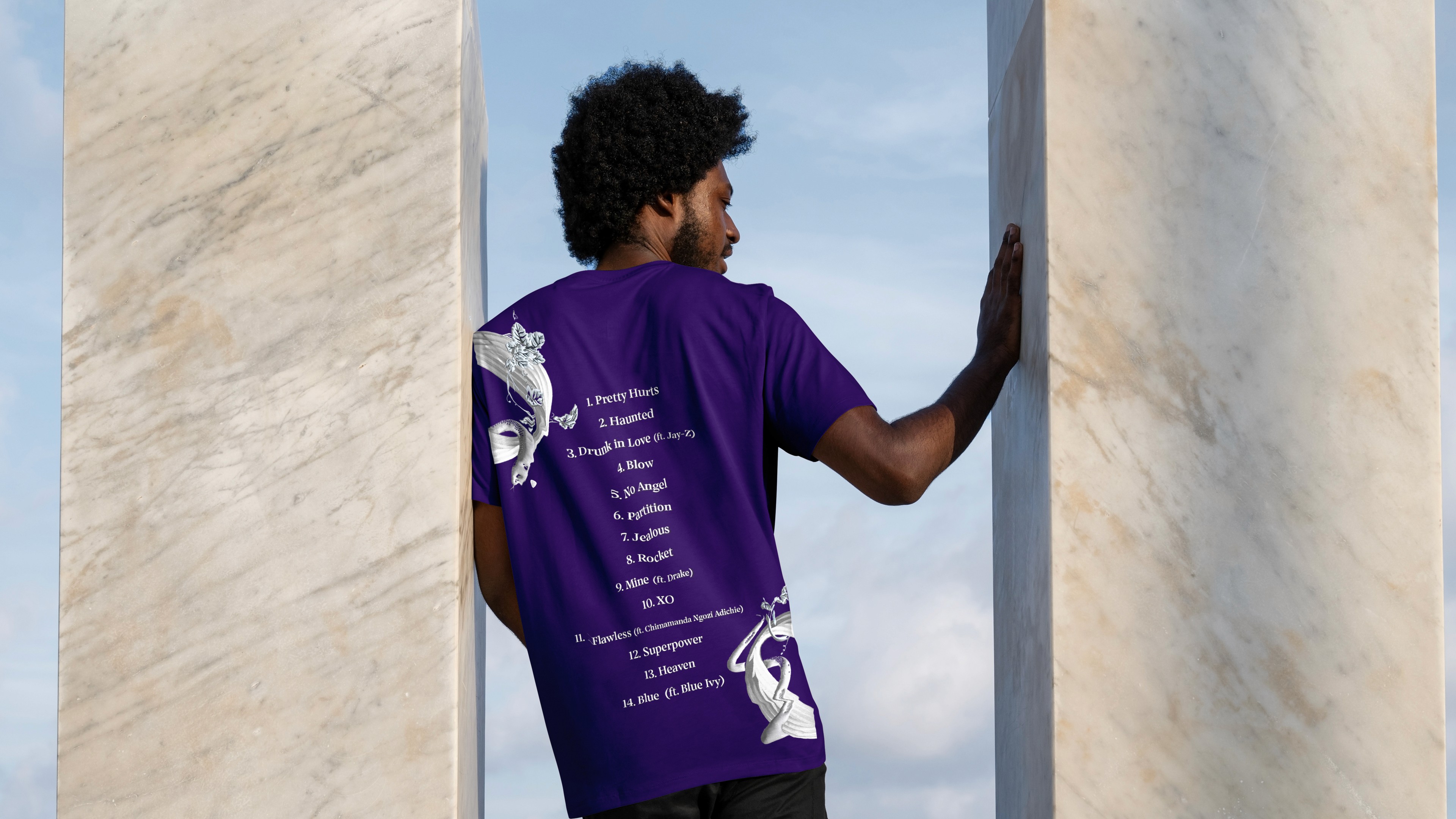
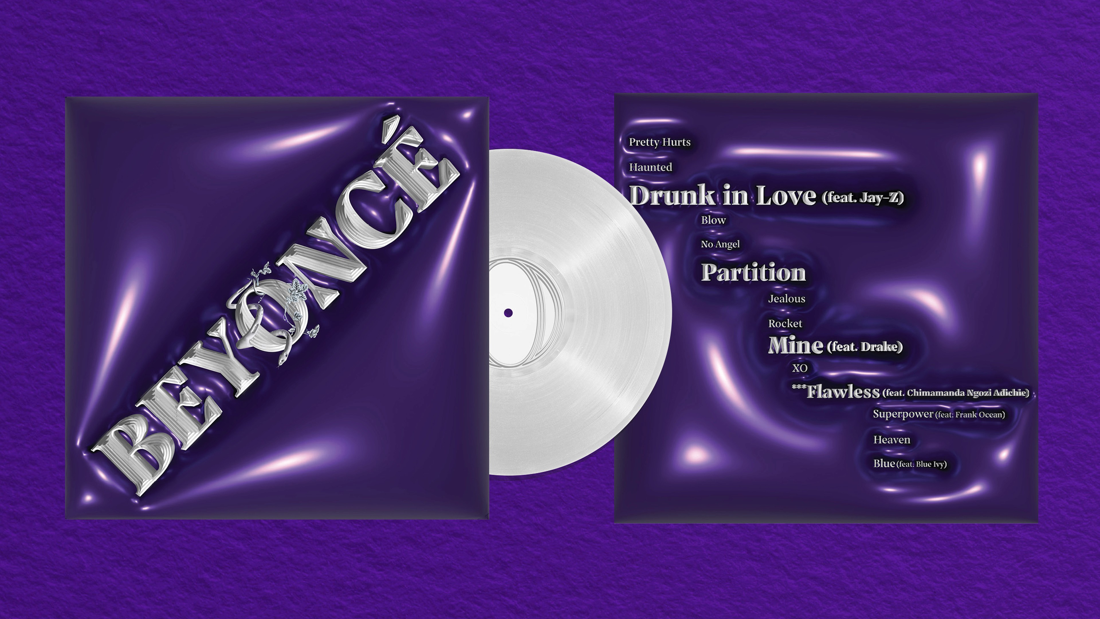
The rebranding strategy reimagines Beyoncé through typography and symbolism. By establishing a design visual system in the rigidity of neoclassical architecture and flooded in rich, visionary indigo, the brand bridges the gap between the earnest qualities and private introspection in the lyrics.

Solution

The architectural elements reflect her undeniable influence and power in pop culture, while the color palette guides the audience through the album's deeply personal, thought-provoking narrative.

Index